Typography | Task 3: Type Design & Communication
|| 16/05/23 – 26/06/23 (Week 7 – Week 13)
|| Liau Kah Man, 0339084
|| Typography
|| Task 3: Type Design & Communication.
3. Process Work
1.1 Pre-recorded lectures/briefings
BRIEFING FOR TASK 3 - TYPEFACE CONSTRUCTION (SHAPES)
Set up Artboard in AI: 1000 pt height.
Draw out rulers: Right-click on artboard > Show Rulers (points). Put your baseline
at 0; generally, x-height is 500 pt, but determine your own via your own design.
To have the dots at the outlines: Path > Outline Stroke
]EXTRA - HOW PUNCTUATIONS RELATED TO EACH OTHER? (Source: Insta@grillitype)
.
Its shape is related to i (dot), but slightly larger. Heavier
font requires heavier punctuation.
Large enough to indicate a pause
in text, but not interfere with the flow of reading.
May slightly
less overshoot than O (round period) or sits directly on baseline
(square period).
,
Roughly the height of two stacked periods.
Comma head slightly smaller than period.
Downstroke of terminals angle is related to the angle in S.
...
It replaces three consecutive periods.
Decreasing dot's width and weight.
1.2 Class Summary
Week 8: Tried a bit of calligraphy using 5 tools.
Week 9: Tutorial to digitalize our calligraphy.
Week 10: Taking Goodwork to share the importance of research to break new ground. Create but based on other researches too. However, most of the things are not apple to apple, so find something similar.
Tips
Methods: (1) brush to write + minimal pen tool to adjust. (2) pen tool to write. (3) shape building tool, then adjust, which you're fully constructing it instead of the computer helping you. Took longest time but precise.
To add roughness to your type: Calligraphic Brush Options > Edit accordingly.
To make lines become "editable" shapes. Object > Path > Outline stroke
Use pathfinder > Minus front
Week 11: We had a small activity which everyone gives comments on e-portfolio of two locals and two foreigners outside our table. Mr Vinod gave a tutorial on FontLab.
Setting up FontLab:
(1) Ctrl + , (Edit > Preference) > Paste & Duplicate > Mark
"Keep stroke and colors, place color elements" > Mark "Import original
position: prefer AI vector for format" > Mark "Keep position if
available" > Mark "Pasting contour to another element preserves
appearance."
(2) Open Files:
• Font info
> Name your font's Family name, and Style name.
• Font Dimensions >
x-height 500
• Note > To write
notes of your typefaces: "This is a font for display uses only, please
don't use it as text. This is a licensed/- typeface. You can visit my
website for more details, e.g. your blog link.
• Legal > Copyright. Google EULA licensing for
more.
• License > Copy
paste your license agreement here.
• Trademark > Your nameline, eg. ·v·
.png)
Figure 1.3.1 Example of a license agreement, Week
11 (13/6/2023).
Task 3: Type Design & Communication (30%)
The end goal is to design a few western alphabets of your own design: a e t k g r i y m p n ! # , . To begin, study and analyze (deconstruct) anatomical parts of two existing font designs that adheres to the direction that you would like to head in. Then do rough sketches to explore the options and begin digitalization upon approval. Software: Adobe Illustrator (AI) then FontLab7 demo.
Finally, use the fonts to create a poster with a few rules:
- Letters that you use in your font should be a sentence of about 6 words (if include words like I, am); or a sentence of about 4 words (if your words are long).
- Cannot change the size of the sentence.
- Can play with alignment and composition.
- PDF (One portrait layout in A4 size)
- To write credits (eg. Kezia Serif by Vinod J. Nair, 2021.), use Univers (Regular) 12 pt, leading can be 2.5, 3 or larger for A4 paper.
Marking Criteria:
- Evidence of in-depth research and visual analysis is visible.
- Multiple ideas have been explored with great care and deliberation.
- The design process showcases knowledge of typographic convention, methodology and production.
- The designs are extremely well crafted, consistent and technically sound.
- To develop student’s ability to construct a readable and legible font.
- To develop student’s ability to design a font with consistent characteristics premised on research and analysis.
Timeframe:
- Week 8 – Week 12 (Deadline on Week 13)
3.1 Research
To begin, we are tasked to study and analyze anatomical parts of one (1) existing font designs from the 10 fonts given and one (1) other font from fonts.google.com, font.share.com, etc., by deconstruction or dissection. The purpose of deconstruction is to give us a general idea/principle of how other create their font.
I also observed how details of different letters differ from one and another.
3.2 Exploration
The method to create a font is selected by our lecturer --- created
via calligraphy. We are required to use five tools, preferably most
of them are non-conventional writing tools to write vertical,
horizontal, diagonal, circular strokes followed by AOTMX or aotmx.
This is for us to practice and get use of writing with these tools,
in a certain angle and pressure, so that the calligraphy (font)
produced will be logically consistent in stroke weights, angle,
etc.

Figure 3.2.1. Written vertical, horizontal, diagonal, circular strokes, aotmx using a 50-sen coin, Week 1 (23/4/2023).
After that, write "aetkgriympn" or "AETHGRIYMPN" in 5 variations (styles) using the 5 tools, which totals up to 25
styles. Select one variation from each tool, which totals up to
5 variations.
 Figure 3.2.2 The 5 choosen variations from 5 tools,
Week 1 (23/4/2023).
Figure 3.2.2 The 5 choosen variations from 5 tools,
Week 1 (23/4/2023).
Further explore on the letters using tool 3 (wooden stick).


Figure 3.2.3 - Figure 3.2.8 The 5 choosen variations from 5 tools, Week 1 (23/4/2023).
3.2 Exploration
The method to create a font is selected by our lecturer --- created via calligraphy. We are required to use five tools, preferably most of them are non-conventional writing tools to write vertical, horizontal, diagonal, circular strokes followed by AOTMX or aotmx. This is for us to practice and get use of writing with these tools, in a certain angle and pressure, so that the calligraphy (font) produced will be logically consistent in stroke weights, angle, etc.
 |
Figure 3.2.1. Written vertical, horizontal, diagonal, circular strokes, aotmx using a 50-sen coin, Week 1 (23/4/2023). |


Figure 3.2.3 - Figure 3.2.8 The 5 choosen variations from 5 tools, Week 1 (23/4/2023).
3.3 Digital Exploration
Prior digitalization, I have selected the best written "aetkgriympn"
and imported to AI to digitalize them.
Figure 3.3.1.
Where my best written "aetkgriympn" come from, Week 1
(23/4/2023).

Figure 3.3.2 Compilation of the best written
"aetkgriympn", Week 1 (23/4/2023).
Using an artboard with a height of 500 pt with guides, my
calligraphy is digitalized following the
sequence "aetkgriympn". Using the original written version as
reference, I used Pen tool to draw the midlines of the letters.
Then, I used the Width tool to adjust the width of each letter.
Along the way I decided to only remain some of the core features as
overall there might be too many things going on in this one font. I
abandoned the big head serifs on the ascenders of t, k, y and
p.

Figure 3.3.3 Draft 1 after Pen tool and Width tool, Week 1
(23/4/2023).
By using the Pen tool and Width tool method, a lot of
features were not drawn out, especially y, m, p, n.
-100.jpg)
Figure 3.3.4 Draft 2 after adjusted the edges and
width strokes, Week 1 (23/4/2023).

Figure 3.3.5 Outline mode of Draft 1 (in line and
in shapes form) and Draft 2, Week 1 (23/4/2023).
Comparing the looks of the best written a and the a in Draft 1, I
like the structure of the written one. Its fat round end of the stem
completed the letter beautifully. After that I attempted to adjust
the shapes of all the letters to accommodate that one letter a.
Ha-ha. At the same time, I adjusted some of the stroke width for the
font look more consistent. And now the look is rounder,
smoother.
Not bad I would say, but indeed its distinct features which makes
it special became not apparent. So, I'm back to square one, Draft 1.
This time I focused on bringing back some of the nice features. I redraw the shoulder of p using Curvature tool to outline my calligraphy and applied to m and
n with some adjustments, so that m, p and n have similar features. I also adjusted on the k, g and y which look weird within the
others.
-100.jpg)
Figure 3.2.6 Draft 3 started from Draft 1 again,
adjusted m, p, n, k, g, y, Week 1 (23/4/2023).
Stucked in the creative block, to continue, I searched for existing
font designs similar to my typeface and found Fruktur (Italic) resembled the most --- especially the shoulders of m, p, n.

Figure 3.2.7 "aetkgriympn" in Fruktur (Italic)
font, designed by Viktoriya Grabowska, Eben Sorki, Week 1
(23/4/2023).
Here's what I noticed from the overall view of aethgriympn,.!#:
-
This typeface is not symmetrical. It has different stroke
weights which make up its distinct character. It has tall x-height,
small counters and small open counters.
-
Maintaining of the x-height. None of these letters
exceeded baseline, they only adjust to exceed the mean line if
needed, to look optically same size.
-
Mean line. ¶ Exceeded (overshoot): Curved letters
like a (arm), e (shoulder), g (arm);
other letters
like k (arm), y (arm); Other
parts remained equal. ¶ Undershoot (didn't reach x-height): i (stem), probably due to its rectangular dot taking up
spaces. The designer may want a gap between the dot and stem of i,
thus reduced height of stem and moved up the dot and exceeded the
cap line.
-
Stem. In general, the stem in this typeface has a distinct shape,
starting from its thickest width and then narrowest at the middle
stem then become thicker again. For k, its bottom stem is thinner
than others' bottom stem. The stems finished with a slur, unless it's attached to at tail.
-
Slur. ¶ Different
thickness:
k and r thicker than e and i. ¶ Different length:
e is longer than a, r and i. ¶ Different angle: r points relatively lower than others.
-
How the bowl meets the stem: Left arm of y follows the
design of stems instead of stress (left) of a, e, g, which there is
only slight decrease in thickness when reaching the base line and
continued with another stroke from thick to narrow for the
link/neck.
This time, I want to further study on how others
would design the letterforms that look somewhat
mirrored: a and e; p and g. I studied and analyzed their
anatomical parts by deconstructing them.


Figure 3.2.8 Deconstruction of a, e, p, g from Fruktur
(Italic), Week 1 (23/4/2023).
Learn how the letters are formed with shapes. Deconstructing
references - type appreciation, study anatomical parts (what are its
features, etc).
I then focus on adjusting the body &/ character width of my font
design.

Figure 3.2.7 Character width of
"aetkgriympn!#,." in Fruktur (Italic) font, Week 1
(23/4/2023).
New analysis (observation) in Fruktur (Italic) font:
-
Overlays between letters: tk. Anything beside i, in this case, ry. Punctuations: , ! #
-
Kerning:
aet and mp have larger kerning.
-
Character width:
Most of the alphabets are 424 pt (agypn). Narrower alphabets include i (247 pt), t (285 pt), e
(338 pt), r (379 pt), k (402 pt). Wider alphabets
include m (629 pt).
-100.jpg)
Figure 3.2.7 Character width of "aetkgriympn!#,." in
Fruktur (Italic) font, Week 1 (23/4/2023).
Whereas my font's width analysis is as below:
-
Overlays between letters: kg, ry, mp, !#,
-
Character width:
Probably 500 pt in average. atr (425-476 pt).
-
Narrower alphabets include e (380 pt).
-
Wider alphabets include yn (532-538 pt), kgp
(568-606 pt), m (700 pt).
In average and overall, my font has wider character width due to
the thicker stroke weight and my font is more slanted, taking up
more space. One big different compared to Fruktur is my k is in the
wider alphabet category but for Fruktur is in the narrower alphabet
category. Also noticed I can only categorize them in range, so
perhaps my next step is to try standardizing some of the width.
Updated widths of my font:
-
Narrower alphabets include i (241 pt), e (380 pt).
-
atr (425-445 pt), k (474 pt).
-
Wider alphabets include yn (530 pt), gp (580 pt).
-
Extra wide alphabets: m (700 pt).
-100.jpg)
Figure 3.2.8 Compilation of chosen adjusted version
of "aetkgriympn!#,." after exploration and adjustments of each
letter to fit together, Week 1 (23/4/2023).
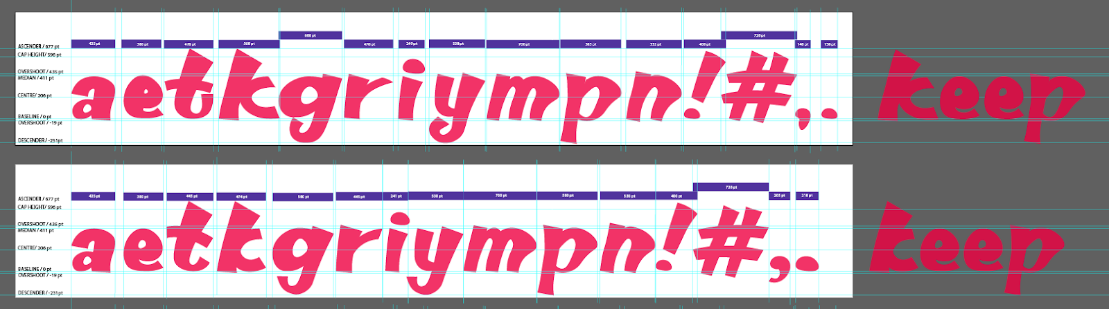
Figure 3.2.8 Before and after
adjustments of features, Week 1 (23/4/2023).
The two "keep" beside is to compare how the different k looks when
combined as a word.
Up to now, I didn't know what to do to improve it so asked around for
comments. When I explain how my font came from a wooden stick, I
realized the version to finalize the calligraphy tool (Figure
3.2.1 or see Figure 3.2.9 at below) and the version after practicing
with the tool have changed quite drastically.

Figure 3.2.9 Original version of style to
finalize calligraphy tool and the version after practicing,
Week 1 (23/4/2023).
Added in some features of the strokes and modified some gap details
between the two strokes that were very thick and too
close.
3.3 Digital Exploration
Prior digitalization, I have selected the best written "aetkgriympn" and imported to AI to digitalize them.
Figure 3.3.1. Where my best written "aetkgriympn" come from, Week 1 (23/4/2023).

|
| Figure 3.3.2 Compilation of the best written "aetkgriympn", Week 1 (23/4/2023). |
Using an artboard with a height of 500 pt with guides, my calligraphy is digitalized following the sequence "aetkgriympn". Using the original written version as reference, I used Pen tool to draw the midlines of the letters. Then, I used the Width tool to adjust the width of each letter. Along the way I decided to only remain some of the core features as overall there might be too many things going on in this one font. I abandoned the big head serifs on the ascenders of t, k, y and p.

|
|
Figure 3.3.3 Draft 1 after Pen tool and Width tool, Week 1
(23/4/2023).
By using the Pen tool and Width tool method, a lot of features were not drawn out, especially y, m, p, n. |
-100.jpg)
|
| Figure 3.3.4 Draft 2 after adjusted the edges and width strokes, Week 1 (23/4/2023). |
|
|
| Figure 3.3.5 Outline mode of Draft 1 (in line and in shapes form) and Draft 2, Week 1 (23/4/2023). |
Comparing the looks of the best written a and the a in Draft 1, I like the structure of the written one. Its fat round end of the stem completed the letter beautifully. After that I attempted to adjust the shapes of all the letters to accommodate that one letter a. Ha-ha. At the same time, I adjusted some of the stroke width for the font look more consistent. And now the look is rounder, smoother.
Not bad I would say, but indeed its distinct features which makes it special became not apparent. So, I'm back to square one, Draft 1. This time I focused on bringing back some of the nice features. I redraw the shoulder of p using Curvature tool to outline my calligraphy and applied to m and n with some adjustments, so that m, p and n have similar features. I also adjusted on the k, g and y which look weird within the others.
-100.jpg)
|
| Figure 3.2.6 Draft 3 started from Draft 1 again, adjusted m, p, n, k, g, y, Week 1 (23/4/2023). |
Stucked in the creative block, to continue, I searched for existing font designs similar to my typeface and found Fruktur (Italic) resembled the most --- especially the shoulders of m, p, n.

|
| Figure 3.2.7 "aetkgriympn" in Fruktur (Italic) font, designed by Viktoriya Grabowska, Eben Sorki, Week 1 (23/4/2023). |
Here's what I noticed from the overall view of aethgriympn,.!#:
- This typeface is not symmetrical. It has different stroke weights which make up its distinct character. It has tall x-height, small counters and small open counters.
- Maintaining of the x-height. None of these letters exceeded baseline, they only adjust to exceed the mean line if needed, to look optically same size.
- Mean line. ¶ Exceeded (overshoot): Curved letters like a (arm), e (shoulder), g (arm); other letters like k (arm), y (arm); Other parts remained equal. ¶ Undershoot (didn't reach x-height): i (stem), probably due to its rectangular dot taking up spaces. The designer may want a gap between the dot and stem of i, thus reduced height of stem and moved up the dot and exceeded the cap line.
- Stem. In general, the stem in this typeface has a distinct shape, starting from its thickest width and then narrowest at the middle stem then become thicker again. For k, its bottom stem is thinner than others' bottom stem. The stems finished with a slur, unless it's attached to at tail.
- Slur. ¶ Different thickness: k and r thicker than e and i. ¶ Different length: e is longer than a, r and i. ¶ Different angle: r points relatively lower than others.
- How the bowl meets the stem: Left arm of y follows the design of stems instead of stress (left) of a, e, g, which there is only slight decrease in thickness when reaching the base line and continued with another stroke from thick to narrow for the link/neck.
This time, I want to further study on how others would design the letterforms that look somewhat mirrored: a and e; p and g. I studied and analyzed their anatomical parts by deconstructing them.


Figure 3.2.8 Deconstruction of a, e, p, g from Fruktur
(Italic), Week 1 (23/4/2023).
Learn how the letters are formed with shapes. Deconstructing references - type appreciation, study anatomical parts (what are its features, etc).
I then focus on adjusting the body &/ character width of my font design.

|
| Figure 3.2.7 Character width of "aetkgriympn!#,." in Fruktur (Italic) font, Week 1 (23/4/2023). |
New analysis (observation) in Fruktur (Italic) font:
- Overlays between letters: tk. Anything beside i, in this case, ry. Punctuations: , ! #
- Kerning: aet and mp have larger kerning.
- Character width: Most of the alphabets are 424 pt (agypn). Narrower alphabets include i (247 pt), t (285 pt), e (338 pt), r (379 pt), k (402 pt). Wider alphabets include m (629 pt).
-100.jpg)
|
| Figure 3.2.7 Character width of "aetkgriympn!#,." in Fruktur (Italic) font, Week 1 (23/4/2023). |
- Overlays between letters: kg, ry, mp, !#,
- Character width: Probably 500 pt in average. atr (425-476 pt).
- Narrower alphabets include e (380 pt).
- Wider alphabets include yn (532-538 pt), kgp (568-606 pt), m (700 pt).
In average and overall, my font has wider character width due to the thicker stroke weight and my font is more slanted, taking up more space. One big different compared to Fruktur is my k is in the wider alphabet category but for Fruktur is in the narrower alphabet category. Also noticed I can only categorize them in range, so perhaps my next step is to try standardizing some of the width.
Updated widths of my font:
- Narrower alphabets include i (241 pt), e (380 pt).
- atr (425-445 pt), k (474 pt).
- Wider alphabets include yn (530 pt), gp (580 pt).
- Extra wide alphabets: m (700 pt).
-100.jpg)
|
| Figure 3.2.8 Compilation of chosen adjusted version of "aetkgriympn!#,." after exploration and adjustments of each letter to fit together, Week 1 (23/4/2023). |
|
|
| Figure 3.2.8 Before and after adjustments of features, Week 1 (23/4/2023). |
The two "keep" beside is to compare how the different k looks when combined as a word.
Up to now, I didn't know what to do to improve it so asked around for comments. When I explain how my font came from a wooden stick, I realized the version to finalize the calligraphy tool (Figure 3.2.1 or see Figure 3.2.9 at below) and the version after practicing with the tool have changed quite drastically.
|
|
| Figure 3.2.9 Original version of style to finalize calligraphy tool and the version after practicing, Week 1 (23/4/2023). |
.png)
|
|
Figure 3.2.10 Original version of style to
finalize calligraphy tool and the version after practicing, Week
12 (23/6/2023). |
.png)
.png)
3.4. FontLab
As my type design are different stroke weights causing it to have
optically different stroke angles, I also considered how to improve its legibility by these aspects: Size, spacing and alignment.
.png)
Figure 3.4.1 Screen grab of kerning sentence, Week 13
(30/6/2023).

Figure 3.4.2 Screen grab of character map, Week 13
(30/6/2023).
.png)
|
|
Figure 3.4.1 Screen grab of kerning sentence, Week 13
(30/6/2023). |
|
|
| Figure 3.4.2 Screen grab of character map, Week 13 (30/6/2023). |

|
|
Figure 3.4.3 First time downloading own created font, Week 12
(25/6/2023). |
3.5 Final Outcome
Outré /ˈuːtreɪ/ 1. adj. Very strange or unusual, bizarre.
Regularly Outré, regularly odd and funky.
Font download link:
https://drive.google.com/drive/folders/1vk3MH81fN55__ScnBDQq86IFWaEnwBDb?usp=drive_link

|
|
Figure 3.5.1 Construction of Regularly Outré on art board generated in AI (JPG, 1024px, 300ppi), Week 13
(30/6/2023). |
Figure 3.5.2 Construction on art board generated in AI (PDF), Week 13 (30/6/2023).
.png)
|
|
Figure 3.5.3 Screen grab of "New Metrics Window" with sentence, Week 13 (30/6/2023). |

Figure 3.5.4 A4 poster (JPEG, 1024px, 300ppi) generated in AI, Week 13 (30/6/2023).
Figure 3.5.5 A4 poster (PDF) generated in AI, Week 13 (30/6/2023).
Week 9
General feedback: "Write" the letters, not design. Ensure letters sit on the baseline.
After approval, proceed to practice writing in that style and later
identify the best letters you can use for digitalization (when
instructed).
Specific feedback: 3rd does look super-interesting.
Week 10
General feedback: To create a font, it's more than just writing. You need to start
to refine the lines in such a way that letterforms become font-like. Put
more refinement while maintain the look and feel.
Specific feedback: It looks consistently inconsistent.
Week 11
General feedback: Consistency, one of the most
important rules in creating typeface. Maintain the angle of your stroke.
Thickness.
! Increase power of the stroke.
#
Horizontal lines are seldom straight (italized). The length of horizontal
line sometimes are different. # might be slightly smaller than cap height.
r Make its ear bigger.
t Its
horizontal line is always one side is longer and another side is shorter.
Y Its vertex should be lower (nearer to middle), not
higher.
y if you study serif, one of the stroke is
thinner.
g Its bowl should reach the baseline.
Specific feedback: The refined m and p looks
very different compared to original calligraphy --- important
characteristics is gone. Liked what I see here in your calligraphy but not
on the refined one. Will check the original digitalized one and decide
again --- original one was better. Consistently inconsistent is a
characteristic too.
Week 12
General feedback: Make sure all letters are used in
the poster. Can consider adding subtle texture as background.
Specific feedback: Focus on making sentences that can be placed nicely on the poster, it
doesn't need to have a logical meaning to connect the sentence.
5. REFLECTION
5.1 Experience
While doing the calligraphy, I discovered how the serifs were "invented" via my own experience! Basically, it's due to the tools they are using doesn't store inks like modern pens do. When they use those kinds of tools, they dip it into an ink pile, then write, which most of the ink piled up in the beginning of the stroke, resulting a big fat stroke than subsequent strokes.
While working on digitalization, we had the chance to attend a talk related to the calligraphy industry. It was quite an experience as although I do join lots of random workshops, but surprisingly I never joined any graphic design, calligraphy-related workshops, as the event info somehow seldom reach to my side. It's cool to see there still are people having the skills to write calligraphy directly on an object as the world has become so digitalized and printed.
In the workshop, they also shown a video of the calligrapher writes on the lorry door directly. The attention, the firm strokes, the beautiful and consistent outcome.
5.2 Observations
While adjusting the size of a letter in my own font design, sometimes I would directly press Shift to enlarge it with ratio, which it will increase the stroke weight, leading to not consistency if there are big changes and therefore as said --- slight differences in thickness due to optical/TECHNICAL reasons.
In one of the sessions, we get to roam around the classroom to see others' typography work. It was a cool chance to see my coursemates' work and get to know the owners of the names which I always see in the course name list, or hear when lecturer calls out their name. Would say I definitely seen some originally unnoticed ones shine in their current works :D Also, by the end of the day, I realized seems like no one in class added the side ink changes, how could they not haha its so cool.
Overall, I had fun creating the font and thinking of the sentences for the poster. I find it would be better if we have the * punctuation as it can be used to replace the missing words.
5.3 Findings
Conclusion: Observed, analyzed and created typography. Would
actually be interested to complete the whole set when I'm free. Also,
there are a few things I learnt the hard way:
- Make sure the "dots" on the strokes are completely adjusted nicely first then only start adjusting the stroke width using the width tool, or you will need to back-and-forth these two steps endlessly --- waste of time, gained experience :D
- Upload backup documents more often, or even upload the screenshot progress to Blogspot right after taking the screenshot to save progress. Usually, I would wait till the end to compile and standardize the style to upload to blog, which turns out to be quite risky in a sense.
During these whole series of analyzing and creating typography, as well as attending the calligraphy talk, what I gained the most might be observation skills --- I find myself getting more and more able to notice the calligraphies and typographies in my daily life. I tried applying into my work of what I see/learned from my observation of others' work, perhaps I can apply into future works too.
6. FURTHER READING
Figure 6.1 Typography workshop: BARANG² SENDIRI S’JA – Commercial Vehicle Labels in Malaysia, Low Hsin Yin as speaker Author, Week 9 (02/06/2023, 10AM).
Mr Vinod have invited Low Shin Yin, a type and graphic designer from Malaysia for a typography workshop which is related to this assignment. I’ve summarized what I’ve learnt from the workshop below:
Commercial vehicle labels:
- Represent the legal status of vehicles for commercial usage.
- Different formats: Alignment, writing styles.
- Related jobs: (1) Sign writer. (2) Runners. Help vehicle owners to run errands to register/update document in Puspakom, then writing the labels on the vehicle according to text required. May also help simple wiring/fixing of the vehicle.
Various forms of shortforms in Malaysia:
- BARANG-BARANG SENDIRI SAHAJA
- BARANG2 S'RI S'JA
- BARANG2 SDN SHJ
However, there's a reduced use of handwriting on vehicle. Nevertheless, the handwriters are positive -- will find a different way to get their own income.
Comments
Post a Comment