Typography | Task 1: Exercises
|| 04/04/23 – 09/05/23 (Week 1 – Week 6)
|| Liau Kah Man, 0339084
|| Typography
|| Task 1: Exercises.
TABLE OF CONTENTS
3. Process Work
1. LECTURES
1.1 Pre-recorded lectures
Lecture 1: Introduction
💡This module aims to develop features of yourself, attention to detail,
and composition, which are applicable to the rest of your modules/careers.
By the end of the module, you would see text in a visual way and create
them.
Calligraphy. Writing styles (Write).
Lettering. Draw the writings.
Typography. The art
and technique of arranging type, making written language legible, readable
and appealing when displayed.
Font. Individual font/weight within typeface: Georgia Regular, Georgia Italic, and Georgia Bold.
Typeface. The entire family of fonts/weights that share similar characteristics/styles: Georgia, Arial, Courier.
Why we need good typography? For a different level of engagement, comprehension and effective communication.
Links given in lecture: Type history, History of the Alphabet
Lecture 2: Development
💡It is important to research the
content of your own community, nation or civilization.
Phoenicians write from right to left; Greek writes in a style called boustrophedon (how the ox ploughs), which is alternately from right to left and left to right. Etruscan (and then Roman) painted letterforms before carving, which influenced their stroke qualities.


Lecture 3: Text (Part 1)
Kerning. Automatic adjustment of space between letters. Use for lesser words (e.g.
title), in caps (because they are generally not designed to use in full caps)
Letterspacing. Adds space between letters. Used when there's a large number of words
(paragraphs).
Tracking. Addition & removal of space
in a word/sentence.
There's a debate on whether to change tracking: Because we don't read words as individual letters, we recognize them by shape/patterns. Changing the tracking reduces the recognizability of patterns that these words form.
Typography also sees counterspace between the strokes.
Grey value. Text on a white surface.
Things to alert for each type of text formatting:
- Flush left: Make the ragged right smoother.
- Centered: amend line breaks so that text appeared not too jagged.
- Flush right: Usually use in captions, or axial layout (Figure 1.4).
- Justified: Space between the text produces rivers! Thus, need to kern and track a lot. May use appropriate number of hyphens (but try to avoid using it).

Typographer's first job --- clear, appropriate presentation of the author's message. Avoid type that calls attention to itself before the reader can get to the actual words, this is simply interference. Quite simply, if you see the type before you see the words, change the type.
It's important to know how to choose typefaces to best suit the message at hand. Understand how different typefaces feel as text. Consider their different textures and colour (grey value).
Generally, readable text = x-height is larger than ascender and descender.
How to read 10/13.5? Point size 10, leading 13.5.
How to choose a typeface? If for screen, test it on the screen to see how it looks as text and headline. If for print, print it out in actual size to check if sizing is good and color is even.
Lecture 4: Development
Type Expression Animation - Basic
AI shortcuts:
- Duplicate artboard = Shift+O (to select an artboard, or u can just click the artboard) > Alt+Drag
How to export GIFs using AI & PS?
In menu bar of AI, File > Export > Export as > Use artboard
(yes) > JPEG || In menu bar, File > Export > Save for
Web. Open PS, in the menu bar, File > Scripts > Load files into
stacks > Select files || In menu bars, Window > Timeline > Create
frame timeline || Put the layers into timeline > Adjust time || In
menu bars, File > Export > Save for Web (Legacy) > Preset GIF 128
Dithered
Lecture 4: Text Formatting
Kerning adjusts the space between individual letterforms.
Tracking (letter spacing) adjusts spacing uniformly over
all selected characters.
How to know is there a need to kern? Zoom in to see if there are awkward spaces. When formatting large amount of text, the goal is to get even middle grey color.
Manipulate the grid system. Understand the relationship between
font size, line length, leading and paragraph spacing.
- Font size = 8-12 points
- Line length = 55-65 characters
- Paragraph spacing = 11 pt
- Don't reduce tracking to more than 3x (pressing Ctrl+Left/Right arrow key)
- Column interval = 5-7 mm, sometimes 10 mm
Check baseline grid to achieve cross-alignment.
Understand the different hierarchies of information in your document -- some can be treated differently.
Basics of InDesign:
- Facing Pages is used in book designing
- Margins, columns, grids:
- Layout > Margins and Columns, e.g. 4 columns, Column Gutter 5 mm
- Hide/unhide Baseline Grids: Ctrl + Alt + '
- Hide/unhide Margins and Columns: Ctrl + ;
- Make text & base grid aligned: Ctrl B > Baseline Options > Offset > Leading; Edit > Preferences > Grids > Baseline Grid > Edit Increment Every (acc.to leading), Horizontal Grid line (acc.to font size), as desired.
- Adjustments of textbox:
- Where to check Characters: F8 (Window > Info)
- How to set to kern in small adjustments? Edit > Preferences > Units & Increments > Kerning/Tracking > 5/1000 em
- Shortcut to adjust Kerning/Tracking: Selected row of text, press Alt + < to reduce; or > to increase.
- Ctrl B (Right click text box for Text frame options) > Align > Top/Bottom/etc.
- Shortcut to achieve cross-alignment: Ctrl I (Paragraph Formatting Controls); Increase in doubles for title size. At the top right corner, click Align to baseline button.
- Pages:
- To make 2 pages side-by-side: Pages>Select all the mini pages icons>Right click>Unmark the Allow Seleted Spreads to Shuffle>Drag up the mini pages to arrange
- Others:
- To resize an image: use Direct Selection Tool (A); to cut/crop an image, use Selection Tool (V). Look top right corner for more cropping settings. Alternately, use Free transform tool (E) and proceed.
Week 1: Our lecturer briefed us about the module, his system to organize the class, and set some ground rules. Areas we will cover this semester: Type expression, Type arrangement, Type creation.
Week 2: Our lecturer explained the importance of exercising our own self-judgement. Creative work is more often a leap of faith, a calculated risk. 💡
Week 3-6: Feedback session.
2. INSTRUCTIONS
Task 1: Exercises (20%)
Express the meaning of four(4)
of these words - rain, fire, crush, water, dissipate, freedom, and
sick. Distortion of any of the letters is not allowed, but only
rotate, flip or scale them proportionally. No color may be used in
the exercises. Use only the 10 typefaces given.
(a) Type Expression
- One JPG layout in A4 size (1024 px @300 ppi grayscale)
- File > Export > Export As > Format > JPG > Use Artboard (yes) > Color model: Grayscale > Quality 10 > Resolution 300/150 ppi > Ok
- GIF format (Tutorial given size is 200 x 200 mm)
(b) Text Formatting
- Minor exercises on kerning & tracking: Use your name to practice kerning and tracking. You're free to use different fonts, casings and font weights, using all 10 typefaces provided.
- Main exercises "I am Helvetica" --- PDF & JPG (One layout in A4 size)
- Each expression has been explored with a great variety of ideas.
- All the expressions are perfectly matched in meaning.
- The typographic solutions are extremely well-composed and balanced.
- The expression is excellently crafted (technical), memorable and engaging.
- The textual information is extremely well formatted (font size, line length, leading, alignment, cross alignment, reading rhythm, information hierarchy, sans widows and orphans).
Learning Goal
- To be able to compose and express using textual information.
- To be able to format text for effective communication.
Timeframe
Week 1 – Week 5 (Deadline on
Week 6)
3. PROCESS WORK FOR TYPE
EXPRESSION
3.1 Research
Typography
is about working with existing typefaces rather than creating new
ones. This process requires the designer to go through a series of
decisions like selecting the proper typeface, choosing the point size,
adjusting kerning and line spacing and coming up with a layout that
makes sense.
I began by searching for examples of the given words using Pinterest.
Figure 3.1.1 References for the word "rain", Week 1 (8/4/2023). Note: Links above are clickable.
Figure 3.1.2 References for the word "rain", Week 1 (8/4/2023). Note: Links above are clickable.
Figure 3.1.3 References for the word "rain", Week 1 (8/4/2023). Note: Links above are clickable.
Figure 3.1.3 References for the word "rain", Week 1 (8/4/2023). Note: Links above are clickable.
I realized some words may be expressed using their different meanings, thus searched the definitions of the words given & summarized them. Hoping this will spark better ideas.
Rain /reɪn/ 1. n. The condensed moisture of the atmosphere falling visibly in separate drops; 2. v. Rain falls: [Literary] (of the sky, the clouds, etc.) send down rain; fall or cause to fall or to convey a specified thing is falling in large quantities.
Dissipate /ˈdɪsɪpeɪt/ 1. v. (a feeling or emotion) disappear or cause to disappear. 2. v. Waste or fritter away money, energy, or resources); [Physics] cause (energy) to be lost through its conversion to heat.
Crush /krʌʃ/ 1. v. Compress or squeeze forcefully so as to distort in shape, into a mass, damage or break. 2. v. Violently subdue (opposition or a rebellion). 3. n. A crowd of people pressed closely together. 4. n. A strong but temporary infatuation for someone.
Fire /ˈfaɪ.ə/ 1. n. A process in which substances combine chemically with oxygen and typically give out bright light, heat, and smoke; combustion or burning; a collection of fuel controlled to provide heat or for cooking 2. n. One of the four elements in ancient and medieval philosophy and in astrology. 3. n. A burning sensation (throat). 4. n. Passionate emotion or enthusiasm; a glowing or luminous quality. 5. v. Discharge (a gun); generate impulse (a nerve or muscle cell); send a message aggressively; strong criticism or antagonism. 6. v. Stimulate or excite (an imagination or emotion, e.g. enthusiasm, anger). 7. v. Supply (a furnace, engine, etc.) with fuel; start (engine). 8. v. Bake or dry (pottery, bricks, etc.) in a kiln. 9. v. [Informal] dismiss (an employee) from a job.
Water /ˈwoːtə/ 1. n. A colourless, transparent, odourless liquid that is the basis of the fluids of living organisms. 2. n. A stretch or area of water, e.g. a river, sea, or lake 3. n. The quality of transparency and brilliance shown by a diamond or other gem. 4. n. [Finance] capital stock that represents a book value greater than the true assets of a company. 4. v. Pour or sprinkle water over (a plant or area) to encourage plant growth. 4. v. (of a person's eyes) fill with tears.
Freedom /ˈfɹiːdəm/ 1. n. Power or right to act, speak, or think as one wants. 2. n. State of not being imprisoned, enslaved or restricted (physically to move easily or use something; or mentally affected by something undesirable, e.g. fear). 3. n. [Archaic] Familiarity or openness in speech or behaviour.
3.2 Ideation

Seen a lot of examples of adding facial expressions in their typography. I also have tried it out and along the way had made some simple bending of i or c (#10-14). Kind of liked #12 but not sure if it's considered too distorted.
The k in #15 was drawn accidentally crooked, and apparently, it looks like it's coughing, thus I added some irregular shapes as the saliva, phlegm, or bacteria being coughed out. After that, I proceed to experiment with how to draw a k that best portrays sneezing/coughing (#16-18). Some photos of people coughing are used as references too. Eventually ran out of ideas for coughing k(s) and s looks like a mouth to me at the moment.
Then I proceed to digitalize the preferred expressions of the 4 words. All digitalization of four words, started by choosing different fonts that may best fit the word's meaning (Figure 3.2.0), and then specified adjustments are done to meet the meanings for each word.
Figure 3.2.1 Digital exploration for rain, Week 2 (9/4/2023).

Attempt 1: The letters r, a, i and n as the droplets at the end of the lines.
Attempt 2: I thought Attempt 1 looks like it was raining from bottom to up, so changed the placement of droplets to look like raining from up to bottom.

Figure 3.2.1 Digital exploration for sick, Week 2 (9/4/2023).
Attempt 1: s and ck standing far away from i which is sick.
Attempt 2: i fall sick and feel weak, thus leaning on s.
Attempt 3: Same concept as Attempt 2 but in lesser weight to illustrate the weak feeling.
Figure 3.2.1 Reference for dissipate, Week 2 (9/4/2023). Source: Anthropocene Magazine & Toppr.


The definitions for dissipate include "v. Waste or fritter away money, energy, or resources); [Physics] cause (energy) to be lost through its conversion to heat". Therefore, I have used the figure above as a reference for the shape of steam dissipating.
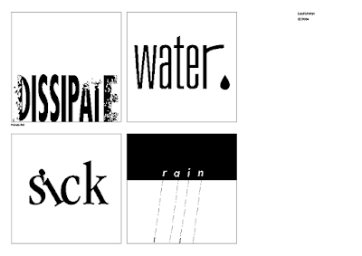
Figure 3.2.1 Current progress to be shown in tutorial class, Week 2 (9/4/2023).

Figure 3.2.1 Digital exploration for dissipate, Week 2 (9/4/2023).
Basically, the thought process during the digital exploration for "dissipate" goes from what type of pixelation is better, then to simplifying it as it looks too "over" if all alphabets are modified.
After finalizing the type expression exercises for four(4) words, my classmates and I are told to proceed to the next step --- choose one(1) to animate it. I chose water. The idea is to show water flowing up through the water pipes and a drop of water leaking out.
To make sure it looked as best as it can, I did more explorations for "water", just in case I missed any possibilities.
.png)
Figure 3.2.1 More explorations for "water", Week 3 (23/4/2023).
I compiled the potential fonts, specifically finding fonts that may best fit the looks of water pipes; tried to make the letters connect by adjusting the tracking and height of letters or using capital letters (it was a bad idea).
Eventually finds the original font was still the winner. Then I proceed to test different tracking settings, placement and size of the water droplets, and compare between r with longer and shorter arms.

Figure 3.2.1 Preferred designs for "water", Week 3 (23/4/2023).
Came up with some personal favourites for "water". The 5th artboard is actually the original version and I still prefer it --- smaller water droplet may look more harmonious with the letters' weight but the bigger water droplet makes the overall look more balanced as the area under the arm of the r is quite empty as compared to the packed area of the text. Also, I think that the larger water droplet can emphasise the meaning of water more.
Figure 3.2.1 Text animation process: Using Pathfinder to
"Minus front" (water text & droplet), Week 4 (24/4/2023).


Above is what it's like without modifying the timeline. I especially like the outcome of the water droplet part. However, the GIF repeated too fast, can't really see the ending look. The text also appeared somewhat wobbly and pixelated - not sure why. The water filling up the pipe was a bit unnatural due to the big swings. So I did some research for the real-life visuals of water filling up a pipe from the bottom, it was a tough search. I only managed to find videos showing water going down.
Figure 3.2.1 Skip to
7:28-7:33 to see the movement of water while filling the pipe from the bottom, Week 4 (24/4/2023). Source: YouTube @Anik Crafts.
Figure 3.2.1 Study of the water movement. Yellow lines = the water lines during that particular
timestamp, Week 4 (24/4/2023).
Figure 3.2.1 Study of the water movement without marking yellow lines, Week 4 (24/4/2023).
The water travel up came up vigorously due to pressure and then calmed down as it reaches the top (the pressure decreases), with occasional larger vibration of movements. Conclusion: The way I portray the water movement going up in the GIF is somewhat accurate.
Figure 3.2.1 GIF attempt 2 (0.03 sec), Week 4 (24/4/2023).
Figure 3.2.1 GIF attempt 3 (0.07 sec), Week 4 (24/4/2023).


3.3 Final Outcome


4. PROCESS WORK FOR TEXT FORMATTING
![]()
Figure 4.1.2 On top of the current kerning, text
formatting with tracking, Week 5 (4/5/2023).
Then I realised the overall leading was a bit inconsistent and I adjusted it as a final touch-up of the minor exercise. Also, I have overlayed the versions with and without kerning, tracking and leading, respectively, to better visualise the difference between them.


Figure 4.1.3 Overlayed for better visualisation of
kerning, tracking and leading, Week 5 (4/5/2023)
Figure 4.1.4 Final of minor exercise on text formatting with kerning, tracking and leading Week 5 (4/5/2023).

Figure 4.2.1 A reference of how much white space is given for creativity, Week 5 (23/4/2023).
4.2.1 Layout reference


Figure 4.2.1.1 Layout references, Week 5 (5/5/2023).
Pinterest @Escuela Arte Alberto Corazon https://pin.it/4lEv7XC
Pinimg @https://pin.it/73su4D5
Behance @Cemile Armas
https://pin.it/35vePUv
Pinterest @Escuela Arte Alberto Corazon https://pin.it/1mnl5Xs
Behance @Victoria Jenssonnie https://pin.it/5FMthxu
4.2.2 Thumbnail Sketches for Expression and Layout

Figure 4.2.2.1 Thumbnail sketches for expression and layout, Week 5 (5/5/2023).
4.2.3 Digital Exploration

Figure 4.2.3.1 Attempts 1-10 for digital text
formatting and layout explorations, Week 5 (2/5/2023).

Figure 4.2.3.1 Attempts 1-10 for digital text
formatting and layout explorations, Week 5 (2/5/2023).
During feedback, it seems like the key message is to play with white space --- minimalist is the key. Thus, more explorations are done as below.

Figure 4.2.3.2 Attempts 11-20 for digital text formatting and layout explorations, Week 6 (7/5/2023).
I like the layout of Attempt 12 and its progression design (Attempts 13-14). However, the character count is too little, thus the line lengths are adjusted as the attempts below and more explorations are done.

Figure 4.2.3.2 Attempts 21-25 for digital explorations for text
formatting and layout - testing out different image sizes, Week 6 (7/5/2023).

Figure 4.2.3.3 Attempts 26-27 for digital explorations for text formatting and layout - H, Week 6 (7/5/2023).


Figure 4.2.3.2 Before and after solving the
rivers, Week 6 (7/5/2023).
HEADING
Fonts: Univers LT Std
Headings - Bold, Bold Condensed, Oblique
Body text - Roman
Caption - Light
Point Size:
Headings - 24 pt, 64 pt, 9 pt
Body text - 8 pt
Caption - 8 pt
Leading:
Headings - 55.5 pt, 22 pt
Body text - 11 pt
Caption - 11 pt
Paragraph spacing: 11 pt
Characters per-line: 51~62 characters
Alignment: Justified with the last line aligned left
Margins (inch): 0.805 top, 0.8 bottom, 0.5 left, 0.5 right
Columns: 17
Gutter: 5 mm
However it does not show my understanding of cross alignment, thus another layout was further refined and chosen as the final --- Attempt 23.
4.2.4 Final Outcome
Fonts:
Univers LT Std
Headings - Bold, Bold Condensed, Oblique
Body text - Roman
Caption - Light
Point Size:
Headings - 24 pt, 64 pt, 9 pt
Body text - 9 pt
Caption - 9 pt
Leading:
Headings - 55.5 pt, 22 pt
Body text - 8 pt
Caption - 11 pt
Paragraph spacing:
11 pt
Average characters per line: 47 characters
Alignment: Justified with the last line aligned left
Margins (inch):
0.805 top, 0.8 bottom, 0.5 left, 0.5 right
Columns: 17
Gutter: 5 mm

Figure 4.2.4.1 Final text-formatting layout
(JPEG), Week 6 (14/5/2023).
Figure 4.2.4.2 Final text-formatting layout (PDF), Week 6 (14/5/2023).
.jpg)
Figure 4.2.4.3 Final text-formatting layout with grids
(JPG), Week 6 (14/5/2023).
Figure 4.2.4.4 Final text-formatting layout with grids
(PDF), Week 6 (14/5/2023).
.jpg)
Figure 4.2.4.3 Final text-formatting layout with grids
(JPG), Week 6 (14/5/2023).
Figure 4.2.4.4 Final text-formatting layout with grids (PDF), Week 6 (14/5/2023).
5. FEEDBACK
5.1 Type Expression
Week 2
General feedback: Logical distortion is acceptable. Sometimes changing the font itself
can fulfil the task (meaning). Try to use punctuation, e.g. brackets.
Using typing directly is not sketching.
Specific feedback: Try to use minimal graphical. For the rain, try to make it straight
instead of a 45°C angle.
Week 3
General feedback: Make sure it has strong impactful impressions and balanced B&W, when the 4 words are compiled together. Fill in the
whites. Don't stretch text. Try different fonts. Use the next two days
to refine, redo or export them; Then animate one of them in motion.
Specific feedback: Dissipate good. Liked the water. For
others, no problem too. For the i as rain droplets, can consider making
it with a combination of different sizes and opacities.
Week 4
General feedback: Good to pause at the end
of GIFs for a few seconds if it's not designed in a loop. Emphasize
the meaning literally. Generally for those text/objects dropping
downwards, can consider letting them fall completely.
Specific feedback: Perfect, no problems here, good.
General self-reflection for Type expression:
1. Do the expressions match the meaning of the words? Is the idea strong? ✓
1a. Are the explorations sufficient?
2. Are the expression well crafted (crafting/lines/shapes)? ✓
2a. Do they sit well on the art board? ✓
2b. Are the composition engaging? Impactful? ✓
3. Are there unnecessary non-objective elements present? ✓
4. How can the work be improved? ✓
Also check on the marking criteria.
5.2 Text-Formatting
Week 5
General feedback: 45
characters per line is good. For justified text, worry about the river.
For full capitalized abbreviations that break the reading flow,
suggestions: (1) downsize the font for them, (2) use small caps.
Specific feedback: For the image of "I am Helvetica", avoid
text-based images. Use the 10 font typeface given. The point size was too big and used up the space --- Reduce font size to have more white space to
play with, or even colour and rhythm.
Week 7
General Feedback: -
Specific Feedback: Good layout but doesn't prove understanding of cross alignment.
General self-reflection for text-formatting
1. Is kerning and tracking appropriately done? ✓
2. Does the font size correspond to the line length, leading & paragraph spacing? ✓
3. Is the alignment choice conducive to reading? ✓
4. Has the ragging been controlled well? ✓
5. Has cross-alignment been established using baseline grids? ✓
6. Are widows and orphans present? ✓
Also check on the marking criteria.
✓ = Checked, has considered it and improved accordingly.
6. REFLECTION
6.1 Experience
Faced issues to while logging in Adobe software due to outdated driver. Luckily, it was solved eventually by following the steps on their website, and then redownloading all the software. Quite frustrated and tired when it happened, as I also was fall sick that week.
Throughout these exercises, I get to learn and get used to some of AI and InDesign's functions and shortcuts. Overall, I enjoyed the exercises, especially pushing myself to get the "that's the one" final outcome. While doing the minor exercises, I am also surprised by how most of the typefaces with similar fonts (e.g. regular, Roman) can look so similar, refer to Figure 6.1.1 below.

Figure 6.1.1 A progress on completing minor exercises on kerning and tracking, Week 5 (4/5/2023).
6.2 Observations
This module gave me my first experience of physical class for Creative Media Design (BDCM) modules. The learning style and classroom atmosphere are quite different compared to classes from my degree, it's like a tutorial & practical vs lecture-based teaching. At first, I'm not used to have progress for each of my work every week to show updates as my degree modules never does that and the previous BDCM module also didn't really stress on that, but eventually I pushed myself harder to meet the request.
At the beginning of every class for Typography, our lecturer will ask us to show our progress through Facebook comments section, that was a really cool idea. I get to see some really great ideas from others too --- the part I liked the most. Our lecturer also always advises us to not rely on his feedback for reassurance, but anyways the feedback given is still very sufficient with general and specific feedback, compared to the general feedback in my major's tutorials and tests, which is extremely little to none.
Another observation is that I realized I tend to only save the visual references somewhere but did not record them properly. Next time I should try to record the design process directly.
6.3 Findings
Basically, typography is all about thinking out of the box but stay simple while considering the rules.
Note to future self: Don't abandon your initial ideas too fast --- no matter good or bad, just record, so that they still have a chance to shine too :D. For example Figure 4.2.3.2, one day I suddenly recalled back the idea and re-execute it, even if I think it will end up being one of my "progress" only. I ended up liking the layout although ended up finding it doesn't really fit the marking criteria (cross-alignment) for this assignment.
7. FURTHER READING

Figure 7.1 Mastering Type: The Essential Guide to Typography for Print and Wed Design, by Denise Borler, Week 5 (10/5/2023).
This book talks about the history, and theory and shows a lot of examples of nice typography. I read the part where they compared a few examples of what is good and bad in text formatting. Some are those I'm not aware of too.
Below I have attached a snapshot from the book (Figure 7.2). It gives me another way to view titles arranged that way.

I also searched some tutorials in YouTube on to make different text effects using AI and InDesign.
How to cut a hole (text) in shape using AI? (Source: YouTube @R4GE VipeRzZ)
In menu bar, Window > Pathfinder (Shift+Ctrl+F9) > Minus front/other appropriate.
- Problems faced: Cannot select all and straight away "Minus front"
- Reason & solution: After "Minus front" of some letters, the counter of letters in black BG (e.g. a, e) are chosen by default as the BG, which did not cover the remaining objects (r and droplets). Check the BG group layers and select the big BG, then proceed as usual.
In menu bar, Effects>Pixelate>Mezzotint>Choose the type you refer. In menu bar, Expand Appearance>Trace image>Default>Expand. Ungroup the letters. Place the texture layer behind the one of the letters. In menu bar, Clipping Mask (Ctrl+&)
Comments
Post a Comment