Typography | Task 2: Text Formatting & Expression
|| 09/05/23 – 23/05/23 (Week 6 – Week 8)
|| Liau Kah Man, 0339084
|| Typography
|| Task 2: Typographic Exploration & Communication (Text Formatting and
Expression).
This task requires the combination of skills learned in Exercise 1 & 2. Also, the final outcome is expected to be suitable, impactful, memorable and engaging.
3. Process Work
LECTURE 4 - TEXT (PART 2)
Ways to indicate paragraph include (but not limited to): pilcrow (¶), paragraph space, indent and extended paragraphs.

Ways to emphasize text for different contrast within a text column:
Example to highlight text.
Example to highlight text.
Example to highlight text. --- Reduce/increase size to match x-height.
Example to highlight text. --- Use black, cyan, magenta for best contrast
& legibility on a black BG.
Example to highlight text. --- Box aligns left margin (visuals) vs Maintain
left reading axis (readability).
"Example to highlight text." --- Create clear indent vs Breaking the left reading axis.
• Example to highlight text. --- Extending to maintain strong reading axis vs Indenting.
Other tips:
- Avoid serious gaffes: widows & orphans. ¶Solution for widows: Rebreak (Shift + Enter) your line endings throughout your paragraph, so that the last line is not noticeably short. ¶Solution for orphans: Resize length of column.
- Text hierarchy: A, B, C heads.
- Ensure visual cohesion of aligned numbers/ capital acronyms in text: (1) Reduce their size by 0.5 pt. (2) Use lowercase numerals/capitals.
- Cross aligning headlines & captions with text type - reinforces architectural sense of the page (the structure), while articulating the complimentary vertical rhythms.

Figure 1.2 Examples of different treatment for headings & subheadings, Week 5 (1/5/2023).
 Figure 1.3 Cross alignment between headlines & captions with text type,
Week 5 (1/5/2023).
Figure 1.3 Cross alignment between headlines & captions with text type,
Week 5 (1/5/2023).
Other notes:
- Leading vs Line Space: Leading is named as leading in typography because historically typefaces are composed using lead square matrices with each line separated by a leading.
- Prime vs Quotation marks
- Widows vs Orphans
.png) Figure 1.4 Leading vs line space , Week 5 (1/5/2023).
Figure 1.4 Leading vs line space , Week 5 (1/5/2023).

 Figure 1.5 & 1.6 Leading in different thickness & leadings spaed between the lead
typefaces, Week 5 (1/5/2023). Source:
CreativePro Network
&
Scrap Girls.
Figure 1.5 & 1.6 Leading in different thickness & leadings spaed between the lead
typefaces, Week 5 (1/5/2023). Source:
CreativePro Network
&
Scrap Girls.
.png)
Figure 1.7 Prime (above two; ' means inches, '' means feet) vs Quotation marks (bottom two), Week 5 (1/5/2023).
.png) Figure 1.8 Widow vs Orphans, Week 5 (1/5/2023).
Figure 1.8 Widow vs Orphans, Week 5 (1/5/2023).
LECTURE 5 - UNDERSTANDING
Observe & compare:
- Stroke weights
- Arc of brackets connecting the serif to the stem
- Symmetrical/-
- How the stems finish
- How the bowls meet the stems
- Maintaining of the x-height
- Counterforms//counters (the space)
- Median line. The line above the baseline. Curved strokes must exceed median line and baseline to look optically same size.
Some tips on creating typefaces:
- Don't overload your typeface with a lot of characteristics. As this leads to a very decorative but also very sophisticated letterform. Simplify your characteristics within the strokes of your letters and it needs to be replicable in all the other letter forms (consistency).
- Examine counters.
- Include design principles into your typography: Contrast.
.png) Figure 1.9 White spaces are forms, black
spaces are counters, Week 5 (1/5/2023).
Figure 1.9 White spaces are forms, black
spaces are counters, Week 5 (1/5/2023).
Importance of understanding forms and counters:
- How well you handle counters when you set type determines how well words hang together (aka how easily we can read the words).
- Examining them in close detail provides a good feel for how the balance between them is achieved and a palpable sense of letterform's unique characteristics.
- Gives a glimpse into the process of letter-making.
.png) Figure 1.10 Examine forms and counters in
close detail, Week 5 (1/5/2023).
Figure 1.10 Examine forms and counters in
close detail, Week 5 (1/5/2023).
.png) Figure 1.11 Variations of contrast, the most
potent dynamic, Week 5 (1/5/2023).
Figure 1.11 Variations of contrast, the most
potent dynamic, Week 5 (1/5/2023).
LECTURE 6 - PRINT & SCREEN
 Figure 1.12 Example of typography on screen
with some comments on it, Week 5 (1/5/2023).
Figure 1.12 Example of typography on screen
with some comments on it, Week 5 (1/5/2023).
Good common typeface for print: Caslon, Garamond, Baskerville (characteristics of elegant, intellectual & highly readable when set a small font size. Versatile, easy-to-digest).
Things to consider for screen:
- Typeface: taller x-height (or reduced ascenders & descenders), wider letterforms, more open counters, heavier thin strokes and serifs, reduced stoke contrast, modified curves and angles for some designs. ***Nowadays due to advancement of screen quality (resolutions), problems used to be there are no longer there. Example: Verdana, Georgia. ¶Typefaces intended for smaller sizes are more open spacing (to improve character recognition and overall readability in screen).
- Font size: 16 px (20-24 pt) text on a screen ≈ 12 pt text printed in a book/magazine. This is accounting for reading distance. If we read books pretty close: few inches away, then 10 pt; If read at arm length, 12 pt.
- Use system fonts for screen/web safe fonts: Open Sans, Lato, Arial, Helvetica, Times New Roman, Times, Courier New, Courier, Verdana, Georgia, Palatino, Garamond.
- Pixel differential between devices. 100 pixels on laptop vs 100 pixels on a big 60'' HDTV will have different quality.
.png) Figure 1.13 Pixel differential between devices, Week 5 (1/5/2023).
Figure 1.13 Pixel differential between devices, Week 5 (1/5/2023).
Static typography. Having minimal characteristics in expressing words. Bold & italics only offers a fraction of the expressive potential of dynamic properties. The level of impression and impact they leave on the audience is closely knitted to their emotional connection with the viewers. Although static, there is a possibility to include dynamics!
.png)
Figure 1.14 Static vs Motion in static
typography, Week 5 (1/5/2023).
Motion typography can "dramatize" type to become "fluid" or" kinetic". Often overlaid onto music videos and advertisements, in motion following the soundtrack rhythm. It can help to establish the tone of associated content or express a set of brand values. In title sequences, typography must prepare the audience for the film by evoking a certain mood.
Video 1.1 Example of motion typography ---
Se7en, Week 5 (1/5/2023). Source: MrAndycrappers78.
"A great designer knows how to work with text not just as content, he
treats text as a user interface."
- Oliver Reichenstein
2. INSTRUCTIONS
Task 2: Typographic Exploration & Communication (Text
Formatting & Expression) (20%)
Typographically compose and express the given content. No color and
images are allowed, but some very minor graphical elements: line, shade,
etc. might be allowed.
Explore several options in expression and layout (sketches). Execute a good layout, with an expressive and appropriate headline in line with the spirit/message of the text.
- 2-page editorial spread (200mm x 200mm per page)
- With baseline grid (JPG & PDF)
- Without grid (JPG & PDF)
Marking Criteria:
- Explorations. The typographic expression has been explored in great variety and creatively.
- Communication. The expression conceptually and typographically communicates the meaning being conveyed.
- Format. The textual information is extremely well formatted (font size, line-length, leading, alignment, cross alignment, reading rhythm, information hierarchy, widows and orphans).
- Layout & Composition. Suitable, impactful, memorable and engaging.
- To demonstrate the use of Grids, layouts and page flow.
- To apply the necessary skills and sensibilities for effective typographic communication and achieve good reading rhythm with memorability.
Timeframe:
- Week 8 – Week 9 (Deadline on Week 10)
3. PROCESS WORK
3.1 Research
Other than the Bauhaus topic, I find the code topic would be easier, so I chose the article titled "A code to build on and live by". I started by searching the definition of code (in case I missed any possibilities) and some visual references.
Code /kəʊd/ 1. n. A system of words, letters, figures, or symbols used to represent others, especially for the purposes of secrecy. 2. n. [Computing] program instructions. 3. n. A systematic collection of laws or statutes. 4. v. [Biochemistry] be the genetic code for (an amino acid or protein).
Figure 3.1.1 Visual references for different type of code, Week 5 (2/5/2023).
3.2 Ideation
I am more into the QR code idea, so I decided to go for it. I also sketched out the idea I have in my first glance for another content topic.
Figure 3.2.1 Sketches for "A code to build on and live by" and "Unite to visualize a better world", Week 6 (8/5/2023).
For Attempt 1, I styled the title to look like a QR code and adjusted the color and size of titles' text for better hierarchy. I also tried a different treatment for subtitles, differentiating it from the body text.
After feedback, I learned that the consistency between the message of the title and the content is important. In other words, QR code is not suitable as the content is delivering the message of "designers' code of ethics". Definition of code of ethics is as follows:
Code of ethics /kəʊd əvˈɛθɪks/ 1. n. A set of rules and principles designed to encourage ethical conduct among a group of professionals.
I then thought of code of ethics is like a checklist of rules to follow so I included the checkbox element in my next attempt. I also tried to express another word in the title: build, live by.

Attempt 4: "Build on" is built (placed) on the code, while "live by" is living inside the code.
After another quick feedback, I sensed some miscommunication is ongoing, so I checked the definitions for the other terms, and eventually realized I previously did not fully understand the meaning of those words.
Build on /bɪld ɒn/ 1. v. Use something as a basis for further development.
Live by /lɪv bʌɪ/ 1. v. To agree with and follow (something, such as a set of beliefs). 2. v. To survive by (due to particular status or action).
Yet, no ideas popped out for this in particular, but I do have another concept where code of ethics is written in a book. For Attempt 7, I placed the title like 3 books with different heights standing together.

Figure 3.2.4 Attempt 7 for digital exploration, Week 6 (13/5/2023).

Figure 3.2.5 Reference for books with different heights standing together, Week 6 (13/5/2023). Source: American Experience.
Then I change my thinking direction --- How to make the layout impactful and meaningful. I have tried making the second sub contents' second rows aligned (Attempt 8) and not aligned (original, Attempt 9), as well as placing them aligned top (Attempt 10) or bottom (Attempt 11). The expressions for title also changed along the way according to the different needs of the different layouts.

Figure 3.2.6 Attempts 8-11 for digital
exploration, Week 7 (15/5/2023).

Figure 3.2.6 Attempts 8-11 for digital exploration, Week 7 (15/5/2023).
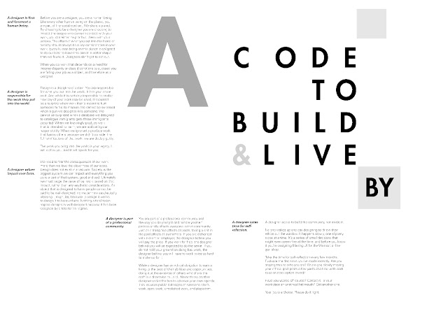
3.3 Final Outcome
 Figure 3.3.1 Final text formatting and expression
(JPG), Week 8 (23/5/2023).
Figure 3.3.1 Final text formatting and expression
(JPG), Week 8 (23/5/2023).
Figure 3.3.2 Final text formatting and expression
(PDF), Week 8 (23/5/2023). Figure 3.3.3 Final text formatting and expression
with grid (JPG), Week 8 (23/5/2023).
Figure 3.3.3 Final text formatting and expression
with grid (JPG), Week 8 (23/5/2023).
Figure 3.3.4 Final text formatting and expression with grid (PDF), Week 8 (23/5/2023).
4. FEEDBACK
Week 6
General Feedback: Explore to find an option that
works. Simple ≠ Simplistic. Keep it simple but explore laterally. The
meaning of "code" in this article is "code of ethics", not computer coding
(0101010011010101), bar code |||||||||||, etc. It's deceiving, gives
people wrong expectations.
Specific Feedback: For Figure 3.2.2, Good
layout but QR code might not be suitable. Layout should be
impactful.
Week 7
General Feedback: Focus on submission requirements (JPG & PDF)
with/without grid. Bodoni is not suitable as body text ← contrast
Specific Feedback: For Figure 3.2.6 Attempt 11, Good (?). As long as there's a good meaning
behind your layout.
5. REFLECTION
5.1 Experience
5.2 Observations
Although Bauhaus topic seems easy, but it does also look hard to be visualized creatively without the usage of graphical elements. Moreover, the example given for the Bauhaus topic is too good to beat, so I just choose between the other two topics: "Unite to visualize a better world" and "A code to build on and live by".
5.3 Findings
To conclude, make sure your design sends out the correct message. To do so, do more research on the subject and understand it better to find the best solution to deliver the message.
6. FURTHER READING
.png)
Figure 6.1 Typography Essentials Revised and Updated:
100 Design Principles for Working with Type, by Ina Saltz, Week 7
(22/05/2023).
The book shows a lot of examples of variations to design a layout. I have summarized some interesting ones below:
- Invisible typography. Via thin stroke width typeface, minimum contrast or small pt size. But beware of legibility!
- Text overlapping text. The key is to focus on differentiation, whether by scale, background, foreground, contrast, structure, or size. Again, legibility is paramount.
- Situation where legibility is not 1° concern. Type can be manipulated in such way that is difficult/impossible to read and still play a pivotal role in the reader’s understanding of the text. Basically, text is now treated as an image to communicate on a different level.
.png)
Figure 6.2 Invisible typography, Week 7
(22/05/2023).
.png)
Figure 6.3 Text overlapping texts, image
overlapping image, Week 7 (22/05/2023).
.png)
Figure 6.4 Legibility taking a back seat, Week 7
(22/05/2023).
Comments
Post a Comment