Design Principles | Exercises
|| 07/04/23 – 28/04/23 (Week 1 – Week 4)
|| Liau Kah Man, 0339084
|| Design Principles
|| Exercises.
TABLE OF CONTENTS
3. Emphasis
0. LECTURES
Line, Shape/ Form, Size, S p a c e, Colour, Value and Texture.
1. INSTRUCTIONS
Task 1: Exercises (30%)
Create 3 artworks each using different
design principles. Any media is acceptable.
- Exercises blog link
- JPEG (A4) of each final design, EACH labelled as <Your Name_Selected Design Principle>
- PDF of Exercises blog
- Exhibits ability to explore options, utilise an appropriate method and/or material and/or be willing to take a risk with intention.
- Maintains excellence in craft no matter what material/s.
Marking Rubrics
- Beginning (0-12) - Limited results. Appears to lack sense of the overall composition and appropriate use of the materials.
- Developing (13-18) - Adequate application of intention. Limited in fully expressing the idea and does not consider the overall.
- Mastering (19-24) - Able to create an example that communicates the intention with a good level of composition.
- Outstanding (25-30) - Integrates information from multiple sources in order to express the principle clearly. Shows ability in considering overall composition and application of the materials.
Learning Goal
- To show and apply their understanding and knowledge of the stated learning goals. To express and identify specific design principles alone or when applied to a complex solution.
- To apply these principles with control to a design in order to meet the needs of the purpose/audience.
Timeframe
Week 1 – Week 4 (Deadline on Week 4)
3. EMPHASIS
3.1 Recap
Emphasis is used to create dominance and focus in a design work.
3.2 Design process
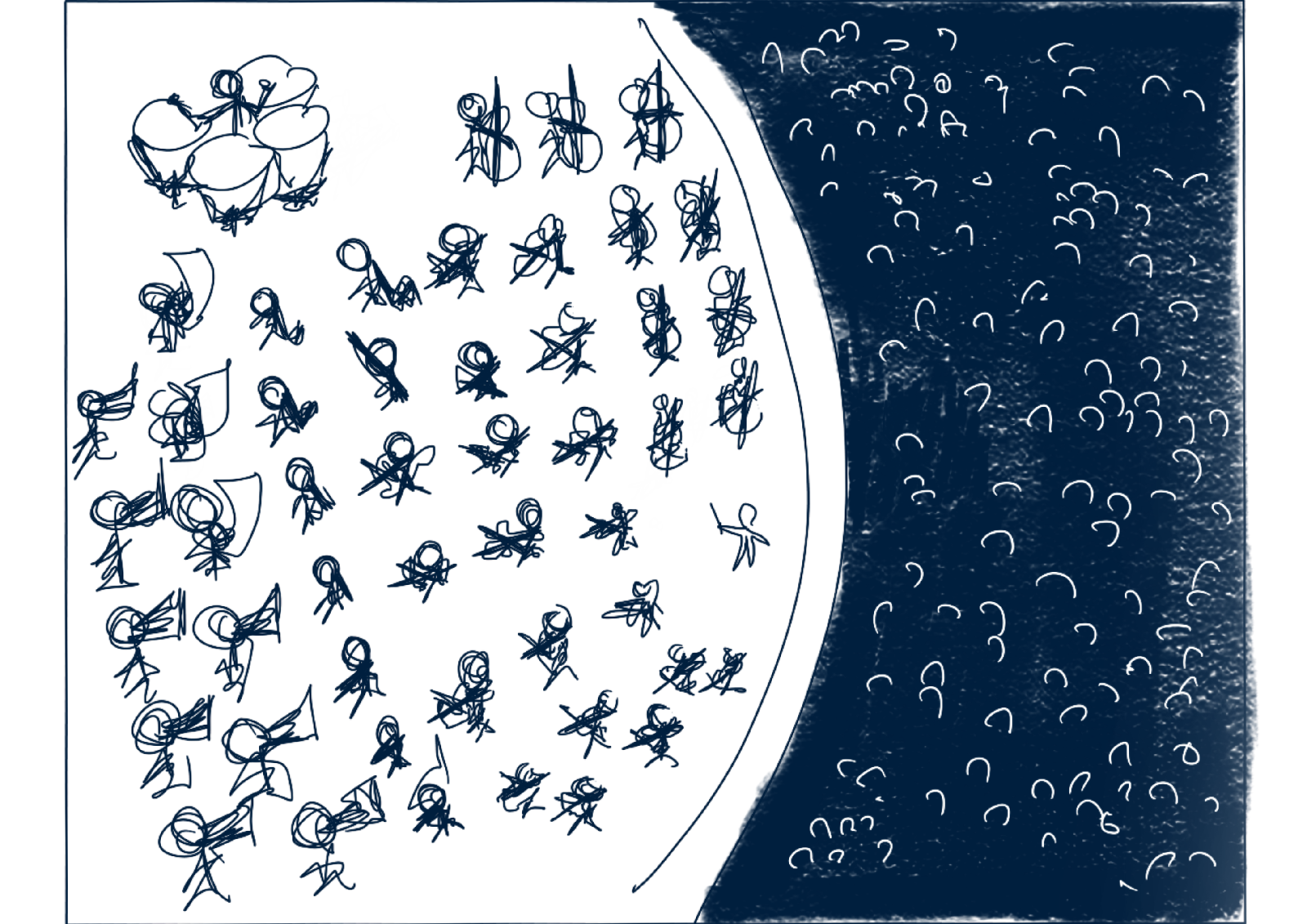
3.2.1 Visual references

Figure 3.2.1.2 Visual references of orchestras' top view, Week 1 (23/4/2023). Note: Reference links above are clickable.
3.2.2 Idea exploration


3.2.3 Final design in JPEG

3.2.4 Feedback
Figure 3.2.2.6: Cannot really find which is te emphasized object as the spotlights are targeting a lot of other things. The timpani is also relatively bigger, taking away the emphasis. Figure 3.2.2.5 colour would be better on emphasis.
4. GESTALT THEORY
4.1 Recap
Gestalt theory describes how human eyes things as human brain is wired to see patterns, logic and structure.
Principle of similarity = Brain craft link between similar elements, even if far apart.
Principle of proximity = The process of ensuring related design elements are placed together; while unrelated elements are placed apart.
Principle of continuation = We prefer to see continuous flow of visual elements and follow the paths.
Principle of closure = We prefer to see complete shapes, thus tend to filling in missing visual information.
4.2 Design process
4.2.1 Visual references
Figure 4.2.2.1 Sketches for Gestalt theory, Week 1 (23/4/2023).
4.2.2 Idea exploration

Figure 4.2.2.1 Sketches for Gestalt theory, Week 1 (23/4/2023).
Tried a few attempts to have the face looks more like a face.
4.2.3 Final design in JPEG and a short rationale

4.2.4 Feedback
5. MOVEMENT
5.1 Recap
Movement is the way a design leads the eyes in, around and through a composition - the path the eyes follows.
Alternatively, it can also be the motion in a visual image when objects seem to be moving in a visual image.
5.2 Design process
5.2.1 Visual references

5.2.2 Idea exploration

5.2.3 Final design in JPEG and a short rationale

5.2.4 Feedback
6. REFLECTION
Overall it was an interesting excersise as I get to think and explore a few ideas for several design principles and finally finalising to the 3 chosen ones. After these exercises, I am more sensitive to notice things around me with the design principles learnt.
Comments
Post a Comment